 Page Builder
  Widgets Bundle
  SiteOrigin CSS
  Installer
 Free WordPress Page Builder, Themes & Plugins
Build clean WordPress sites with a free WordPress page builder, lightweight themes, and open-source plugins that stay out of your way — no bloat, no lock-in, no surprises.
Trusted by WordPress professionals worldwide
Free & Open Source
Free WordPress Page Builder, Widgets & CSS Tools
No bloated frameworks. No vendor lock-in. Just open-source WordPress tools that have been refined over a decade of real-world use.
Page Builder
A drag-and-drop page builder that outputs clean, efficient code. Works with any theme, integrates with the Block Editor, and keeps your pages loading fast.
500K+ active installs
Widgets Bundle
Dozens of ready-to-use widgets including sliders, forms, price tables, and more. Use them with Page Builder or drop them into any widgetized area on your site.
300K+ active installs
SiteOrigin CSS
Fine-tune the look of any WordPress theme with a visual CSS editor. See changes in real time without writing code or worrying about breaking your site.
200K+ active installs
- 0
- Plugin downloads
- 0
- Years of active development
- 0/5
- Star rating on WordPress.org
Tutorials & Guides
Get More From Your Site
Turn Any Page Into a Standalone Landing Page
Design unique, focused landing pages with the new Landing Page Addon for SiteOrigin Premium. The Landing Page addon lets you turn any page into a standalone, full-screen experience, rendered on its own without your theme's header, footer, or sidebars, so your content takes center stage.
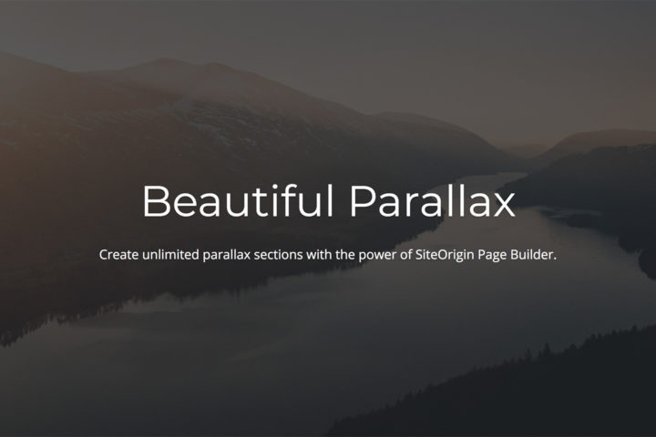
Fixed vs Parallax Background Images: What’s the Difference?
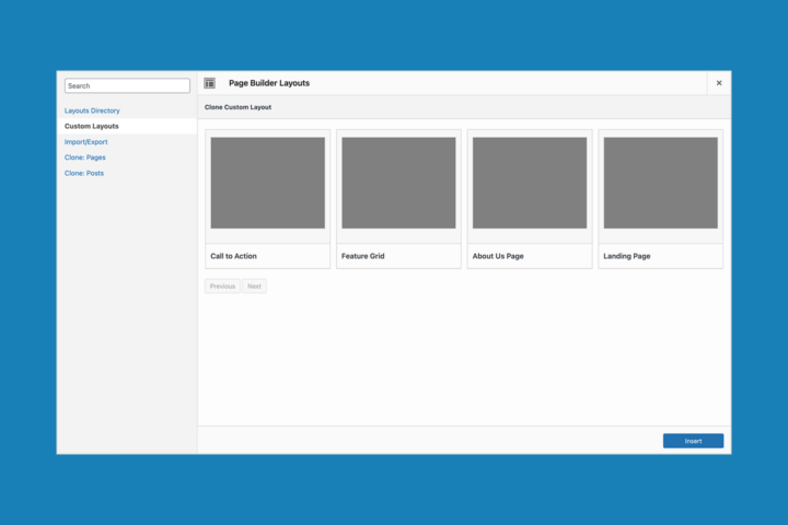
Build Once, Reuse Everywhere: Section-Level Layouts with Custom Layouts

Accelerate Your Workflow with SiteOrigin Custom Layouts

Boost Signups with On-Page Forms and Content in SiteOrigin Lightboxes
WordPress.org Reviews
Trusted by Thousands of WordPress Professionals
Real five-star reviews from the WordPress.org plugin directory.
“Previously I was using Visual Composer which was slowing down page performance. The SiteOrigin Page Builder is really flat, well thought through and you can use it without reading any instructions.”

“This is a great plugin, intuitive with lots of how-to videos and documentation. But for me, the determining factor is customer support. SiteOrigin's customer support is stellar. Super prompt and very comprehensive. I love it!”

“Without it I really wouldn't have my site the way I dreamt it. I cannot praise enough this page builder. The possibility to build very different posts and pages, the ease of use, and the ready, quick and extensive support I received are marvellous.”

“I would have never been able to fall in love with WordPress without this page builder.”

“The best Page Builder out there! Makes building a website incredibly easy.”

“Amazing plug-in. Great support.”

“No frills, build website fast.”

“I've used Page Builder for several sites and love it. So flexible.”

“A responsive support team. What more could you ask for!”

“I've used this page builder since 2016 with no problems.”

“The best free page builder. Really easy to use.”

SiteOrigin Premium Addons for Themes and Plugins
The free tools handle the essentials. SiteOrigin Premium adds professional features to our plugins and themes — including more widgets, advanced layout options, and direct email support.
All addons. Unlimited sites. One simple price.
Every Addon, One Price
No nickel-and-diming. One subscription unlocks every premium addon we make for Page Builder, Widgets Bundle, and our themes. Use them on unlimited sites.
Priority Email Support
Get direct help from the people who actually build the software. Our support team covers all SiteOrigin products with a 98% positive satisfaction rating.
Continuous Development
New addons and improvements ship regularly and are included in your subscription at no extra cost. You benefit from over a decade of ongoing refinement.
Expert Support for Your WordPress Projects
Whether you're on the free plan or Premium, we're here to help you build something great.
“I can't believe how fast, personal and helpful SiteOrigin really is.”
Ian L.
Brand Strategist
“Your responsiveness has been amazing!”
Craig G.
Educator
“With SiteOrigin I always get an accurate answer. With others I'm lucky to even get one.”
Mark N.
Studio Owner